Gantt Chart vs Swimlane Diagram: Which is Better for Your Project
Choosing between a Gantt chart and a swimlane diagram can greatly affect project execution. Discover the strengths and applications of both tools to make an informed decision for your organisation.

Ever been in a situation where you need to choose the right tool for the job but got stuck deciding between a Gantt chart and a swimlane diagram? As a project or portfolio manager, you know that this choice can significantly impact how you plan, execute, and monitor your projects. So, how do you pick the right one? Stick around because, by the end of this piece, you'll be better equipped to decide which is more suited for your next organisational venture.
The Battle of Expertise: Two Tools, Two Titans!
First off, let’s dive into the most basic difference between the two. A Gantt chart is like your favourite timeline on steroids—letting you synchronise task schedules and see overlaps. Meanwhile, the swimlane diagram is the ultimate black belt in process mapping, clearly delineating responsibilities and workflow stages.
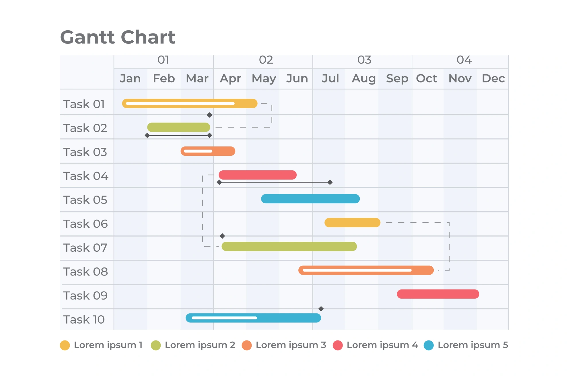
The Gantt chart's allure lies in its ability to visually present the timeline of a project. Imagine a horizontal bar chart, where tasks are lined up by start date, length visualised by the width of each bar, and resources allocated with precision. Developed over a century ago by Henry L. Gantt, this tool has stood the test of time. Why? Undeniably, its clarity! According to a Project Management Institute survey, over 75% of managers find Gantt charts crucial for planning long-term projects. Picture a construction project; have you aligned your contractors with specific timelines? An image of a detailed Gantt chart showing overlapping tasks and varied timelines would be perfect here.
Adding to its charm, Gantt charts integrate with tools like Microsoft Project (which incidentally our audience might love), helping automate task scheduling and resource allocation. This integration has been hailed by professionals for enhancing productivity by over 25% across different industries. Are the benefits sinking in yet?
Swimlane Diagrams: The Workflow Wizards
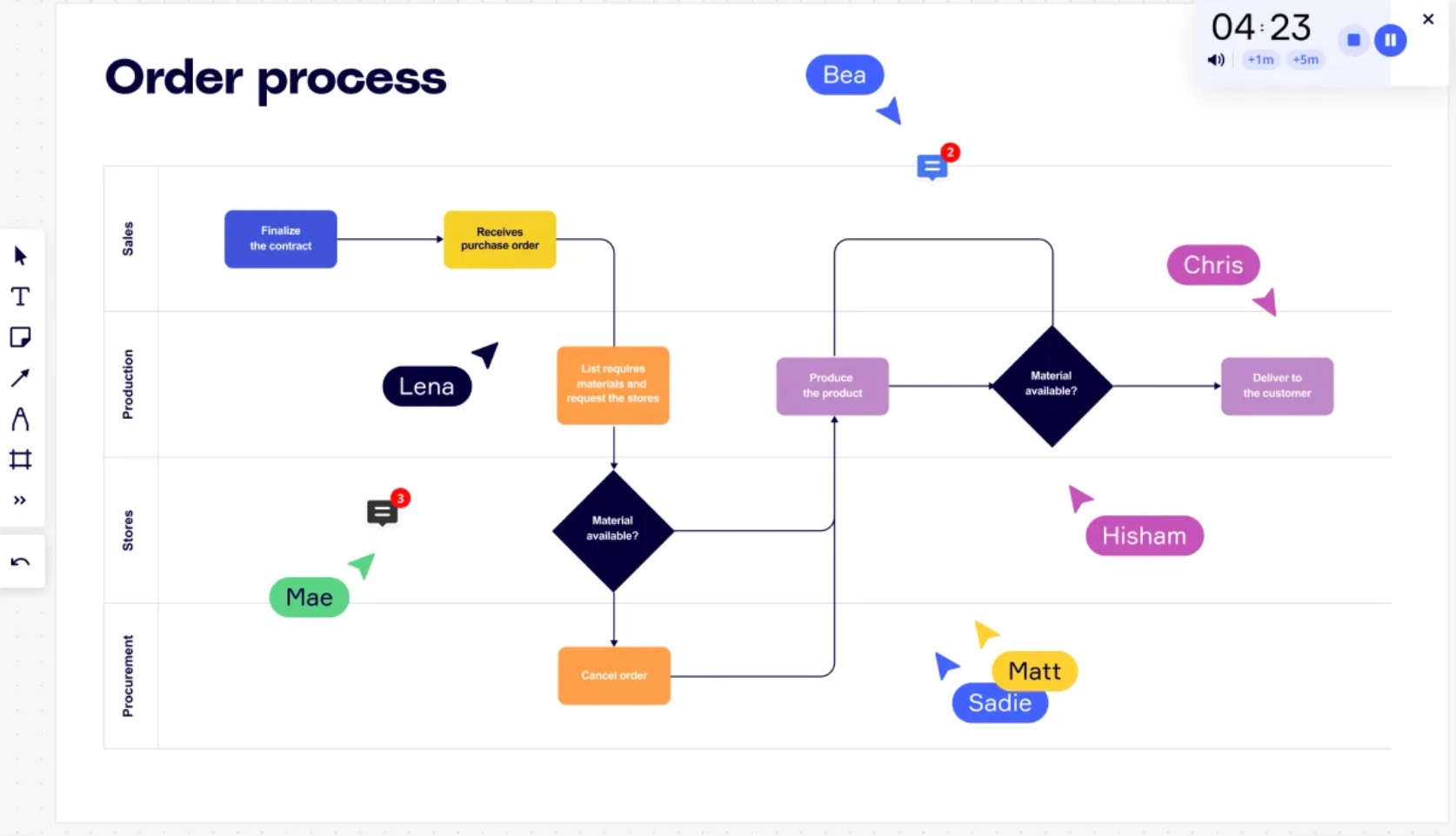
On the other hand, swimlane diagrams bring structure to multitasking chaos with clarity. Designed like lanes in a pool, each allocated a particular division or actor within a process, these diagrams put an end to misplaced responsibilities. In the realm of project management, having accountability clearly marked out can save time and prevent bottlenecks. And who doesn’t love a little more accountability? For instance, software development teams harness swimlane diagrams to capture stages from design to deployment with different colours and lines for each team. Imagine a vibrant swimlane diagram detailing the hand-offs between teams and depicting key process steps—an ideal visual for this section.
However, selecting between these tools isn't always straightforward. If your project complexity requires reversing lapses easily and identifying process owners swiftly, then swimlane diagrams score high. Research highlights that projects using swimlane diagrams often reduce miscommunications to under 20%, proving teams are better aligned and informed of their roles. Pretty nifty, right?
Consideration Crossroads: Deciding Between the Two
While both diagram types offer impressive visual planning, their application often depends on project needs. One helpful question: is your project timing-focused or process-oriented? If timing matters more, with multiple dependencies and numerous tasks, then a Gantt chart would perhaps be a safer bet. Projects heavy on scheduling, like event planning or construction tasks, flourish under the Gantt model. Can you picture the seamless tracking of start dates all on one timeline?
Conversely, if your project is process-driven, frequently needing role allocations and clear flow visualisation, the swimlane diagram unpacks complexities with elegance. Consider complex IT implementations or manufacturing processes; swimlanes help the team know who’s on first base and eliminate communication woes.

Harmony in Integration: The Best of Both Worlds
Here's an intriguing thought: why not use both? These tools aren’t mutually exclusive. Project managers could leverage the meticulous schedule tracking of a Gantt chart while employing the role clarity of a swimlane diagram. Many savvy managers benefit from this by using dual toolsets to cover all bases—it's like running on two tracks simultaneously without missing a beat.
Tool integration happens to be a growing trend. With over 60% of projects using hybrid systems, according to a 2021 PwC study, this combined approach reduces project risk by nearly 30%. Consider the scene where your project suddenly scales in complexity or speed requirements. Bringing in both charts ensures streamlined collaboration and reduces overheads. An image here could show a split screen comparison or an overlay of both types synchronising.
Is it the best of both worlds? It sure seems that way when managers can align intricate timelines with well-defined processes. Combining these powerhouse tools can drive projects towards success, with timely delivery, fewer errors, and robust communication pathways.
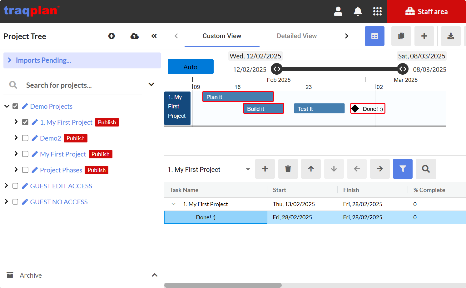
How we decide when to use Gantt Charts vs Traqplans "Plan on a Page" Layout
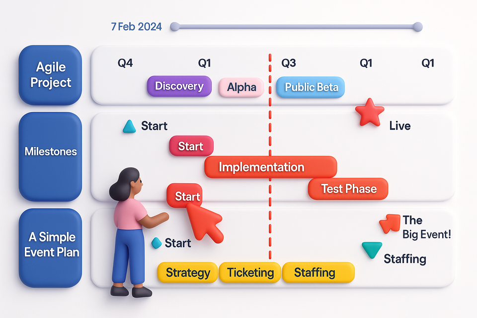
Gantt charts are one of the most intuitive visuals in project management, offering a visual layout of tasks, dependencies, and deadlines. Gantt Charts use one row for each task which bring clarity but can take up a lot of space. So at Traqplan, we recommend using our Gantt Chart layout when viewing single projects, however we recommend switching to our Plan on a Page layout for the portfolio view to see a summary of many projects on one page.
- See the Big Picture – Our Plan on a Page view lays out the entire portfolio, helping teams understand task sequences at a glance.
- Summarise Complex Gantts Easily – Gantt Charts can be complex to understand, especially for your stakeholders. With Traqplan, you can automatically condense Gantts to show top levels summaries, ideal for getting your message across quickly.
- Improve Change Management – Clear version control and progress tracking allow teams to track schedule changes, reducing the risk of surprises.
- Enhance Collaboration – Everyone sees published updates, ensuring better communication and alignment across departments.
- Adapt to Change Quickly – If priorities shift, Traqplan makes it easy to adjust your Gantt chart so your team can respond without disrupting the entire workflow.
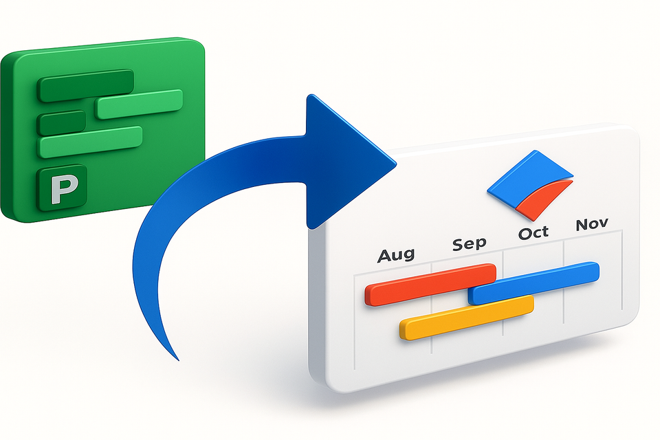
By using a combination of Microsoft Project Gantt charts and our plan on a page overviews, Traqplan helps teams stay organised, meet deadlines, and streamline workflows—making project management effortless. 🚀
Still Uncertain?
While no method offers a one-size-fits-all solution, recognising your demands sets you up for success. Armed with a good grasp of both Gantt charts and swimlane diagrams, your projects are bound to run smoother than your morning coffee routine.
Still not convinced? Run a trial with smaller projects or partial phases to find your groove without immediate commitments. Reach out to our team for insights or software evaluations, and never fear combining tools when needed. Just keep in mind, you’re the maestro here, orchestrating multiple moving parts towards project finale glory. And that, dear reader, is an exciting place to be!